
Design
Branding
Digital

Isabel Lauren Loewe
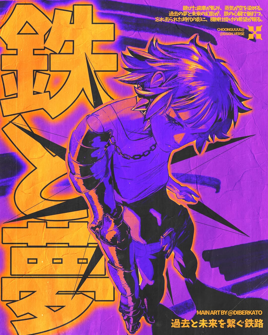
'Dead Legend', 2026
DSGN VERSE’s failed pieces stay on his feed. He keeps them there as punishment for having forced a design when nothing had clicked. For him, that line between what arrives and what gets pushed out is where the work either holds or falls apart.
He figured out once how to stop caring what people thought. He watched creators who make for the love of it and chose that route deliberately. And it worked, at first. He'll tell you he's sliding back into it now, counting likes, wondering if a piece is trending enough, and that it's pulling him away from the work that actually defines him. He hasn't figured out how to get out of it yet.
His definition of success is being forgotten. Work that outlives the name on it, that shapes how other designers think without them knowing where it came from. What he's building toward that is made entirely in Photoshop, self-taught, through smoke typography and displacement maps and grain and whatever two aesthetics happened to collide in his head that day. The technique is experimental and the output is consistent enough to have a signature.
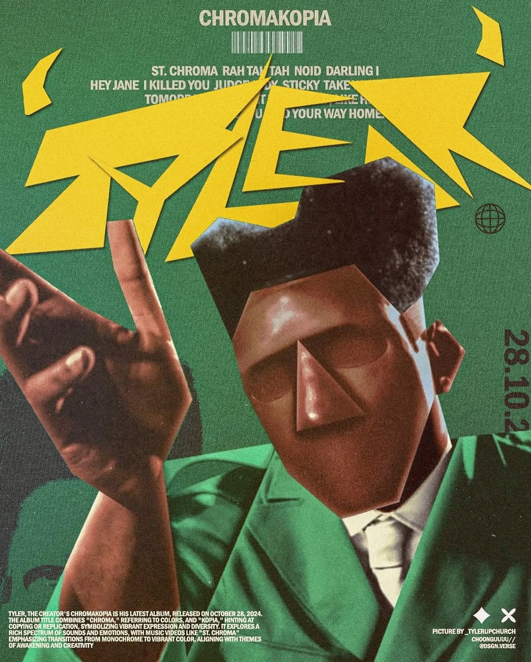
'Chroma', 2024
Take me back to the beginning. What was the first piece of design work you made that felt like yours?
I remember making a poster for my best friends college event he was hosting, back then I had not thought of being a graphic designer but that was the one I was most proud of at the time and spent a lot of time perfecting details
Who or what were you looking at when you were first learning? What actually shaped your eye?
I’m not going to shy away from who influenced me and will be very transparent, when I started designing and researching on what style to pick and what moved me the most and felt like me, I was very inspired by @cuandoestoyaburrido.exe on instagram, If you look back at my earliest designs, that influence is very clear. Even now, I occasionally revisit that work for inspiration.
You self-taught through Photoshop. What did that process actually look like day to day?
It was largely experimental. I would open Photoshop and explore starting with simple subject cutouts, then gradually incorporating typography, textures, and more complex compositions. Over time, that evolved into building full concepts like posters and cinematic visuals.
Your work pulls from music, cinema, street culture, and East Asian visual language. How do you move between those references without it feeling scattered?
I just look at the moment, if I want to do something in a Japanese aesthetic, I’ll just do it, if I wanna do a movie poster I’ll just do it I don’t care if I’m doing something too much, if I feel like I wanna do it, I’ll do it
The Bully poster, the text built entirely from smoke, how did that idea start? Walk me through the build.
I love ye period. So this one specifically was inspired by the live performance he did at the sofi stadium I believe, and it was all, like I said, in the moment, I thought the smoke was something that went very well with the whole bully album and the live event aesthetic
Something that immediately pops out in your work is that it’s almost like you use special effects; you seem like a natural innovator. Where do these ideas and concepts come from?
It’s never my intention to make something, I never plan for days or weeks to make a poster, if something fails, I move into the next poster, same with every poster I make, some days I find an inspiration on instagram some days I find one on Pinterest, I try it out and then add my own creative direction on it and if I like it, I just put it out. Sometimes I mix 2 different aesthetics or 2 different ideas, that’s just something that pops up in one’s mind when you’re in the flow.
When you're trying a technique for the first time with no guarantee it'll work, what does that part of the process feel like?
It’s very trial-and-error. I might follow a guide or tutorial initially, but ultimately I rely on my own judgment. Even if something looks imperfect technically,if it looks right to me and I like it, then it’s a success in my book.
How much of a finished piece is planned before you open Photoshop, and how much happens inside during the process?
A bit of both, there’s times where I’m just driving and suddenly an entire poster with each and every detail pops in my head, sometimes I’m scrolling down my archives and an idea pops up, sometimes I’m looking at other creators subject images that I have saved up and something pops up in my mind. It’s never really planned or unplanned, it’s always about something clicking, if nothing clicks in my mind, I won’t force a design out, and there’s been times where I haven’t posted in months just to give myself a break. I’ve tried forcing out designs but they never work out for me.
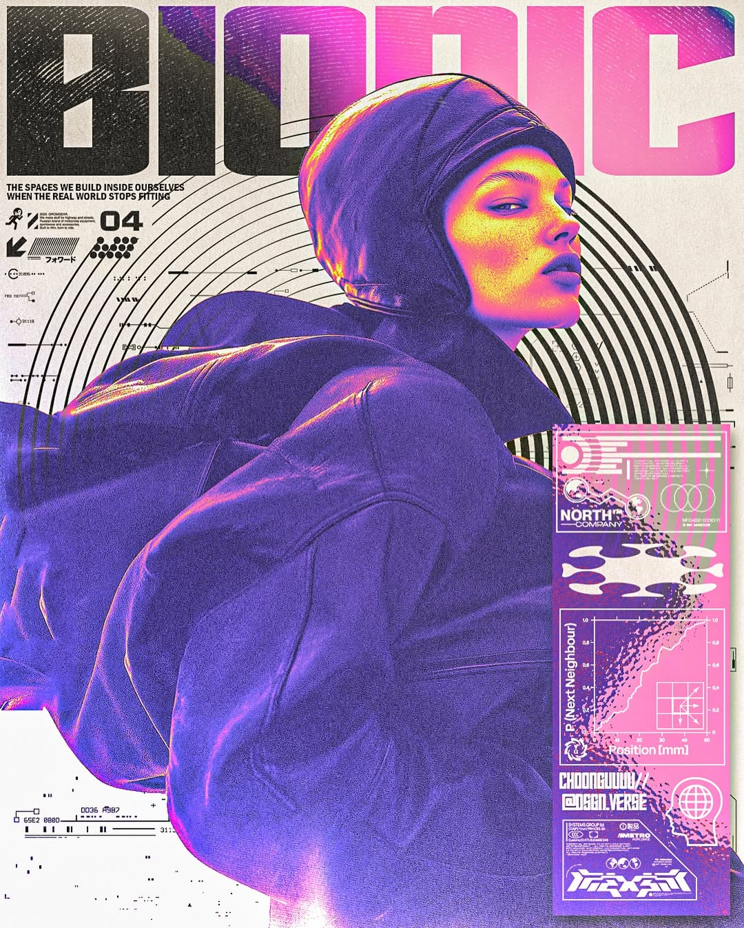
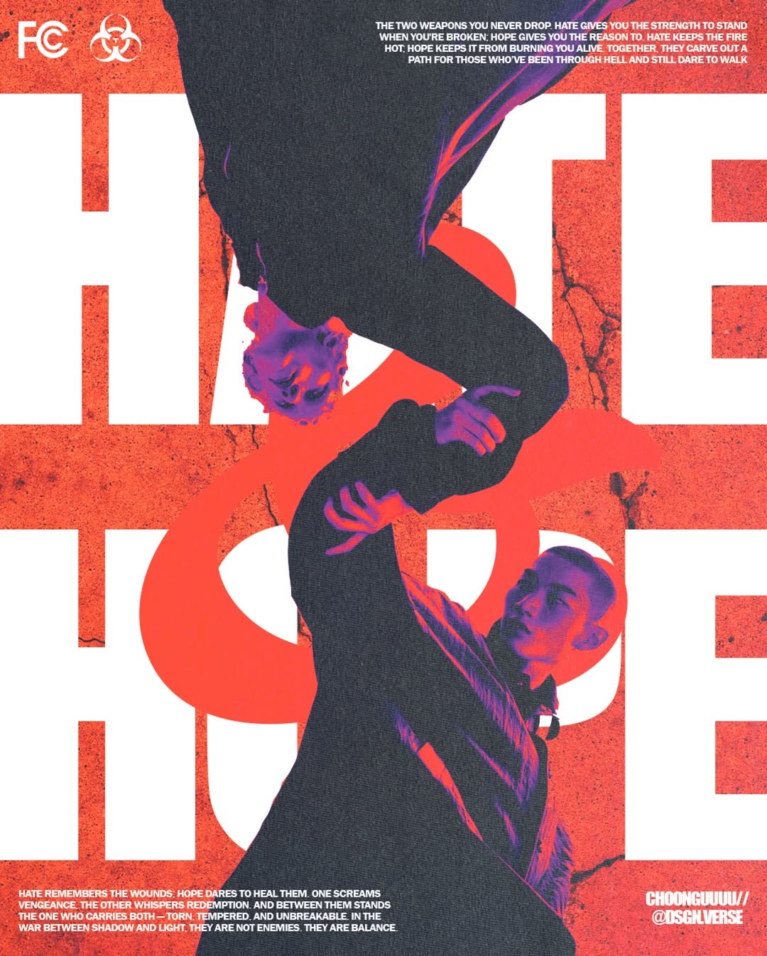
'Bionic', 2025
You seem unbothered by the risk of a piece going wrong. Is that something you had to develop, or has that always been your default?
Had to develop it, always used to think about what other people thought and what they’d think, but then I looked at other creators who just do it for the love of the game and don’t do it for validation, and that’s the route I picked, honestly lately I’ve been going back to that dark place of, “what if I don’t get enough likes” or “what if they don’t like this” or “this one’s not trendy enough and won’t reach out to more people” and honestly it’s pulling me back mentally from putting out more proper designs that define me and I’m on my way to figure out how to get out of it.
What does a failed piece look like for you, and what do you do with it?
A failed piece is something that I did out of force, if I forced a design just to put the design out etc, and I keep that design on my feed just for me to look at it and almost like a punishment for forcing a design, if a piece fails during design, I just move onto the next, very rarely do I come back to a failed design to make it better. Sometimes it clicks and I do end up making it better after giving my brain some rest.
Do you write before you design, or does the writing come after the image exists?
Both. Sometimes typography leads the concept, and other times it responds to the visual. It depends entirely on the piece.
The Pure piece pairs Japanese kanji with a photograph of a Chinese cormorant fisherman. What drew you to that image and that text together?
Most of the time my text inspiration comes from songs I’m listening to at the moment, it was the case with this, and also because a simple life when you’re fishing about minding your own business is very pure in my eyes. When you don’t have worldly distractions and you’re just living a simple life, it’s very pure.
Color is one of the most recognizable things about your work. How do you find your palettes? Is there a system, or is it more instinctive?
Always instinctive, at the moment if I think a colour suits the image, I go with it, I do rarely think to myself that “hmm I’ve done white and red for the past 4 designs, maybe I should switch up the next one” but whatever colour I think fits I’m doing it regardless of what the previous designs were etc.
Some of your pieces are almost monochrome, others are saturated and electric. What determines which direction a piece goes?
I always always listen to music during my designs, so the direction is always instinctive and based on the heat of the moment type of situation.
When you're designing around someone else's music, how do you get inside what the album or artist actually feels like?
That’s a very good question, it’s always how I can combine how I feel AS WELL as how the artist feels, I can’t really explain it but it’s just how the music makes ME feel rather than how it feels to for example The Weeknd. If it’s a commissioned piece for an artist then I go by the direction they give and try to listen to the music and feel how the lyrics affect me.
The Tyler piece for Chromakopia treats the album like a graphic artifact. Were you responding to Tyler's own visual direction for that project, or going somewhere he hadn't?
I got the main subject from @_tylerupchurch and designed the rest of the poster based on that main subject, including some pieces of chromakopia.
You design for bands and creatives, but a lot of your personal work feels like it's in conversation with music you love. What's the difference between designing for a client and designing in response to something?
Designing for a client always has their own creative direction, whatever they say is good or bad will be iterated in the design, but with my own designs I don’t care what others think and just design freely based on what I feel.
Do you consider yourself a designer or an artist? Does that distinction matter to you?
That’s a very good question, I think there definitely is a distinction, there’s times where I design, and there’s times where I make art. I personally see design as structured problem-solving, while art is more about expression. My work exists somewhere between the two.
Your work has a clear signature; someone who knows your feed would recognize a piece as yours. Was that something you intentionally created, or did it emerge on its own?
Definitely wanted to make it that way intentionally, I even recently went about making it more intentional with my own watermark, although I don’t use it as much because I think it takes away some freedom, but I personally try and make a design feel like my own as much as I can, otherwise what would make me stand out in such a vibrant and dense field.
What's a technique in your work that took you a long time to figure out?
Not caring about what others thought, Letting go of external validation. Technically, most things came with practice but mindset took longer.
The smoke typography, the displacement maps, the grain overlays. Where do you source the raw materials you build with?
I rely on consistent resources like Texturelabs for textures, Resource Boy for gradients and displacement maps, and Dafont for typography. Keeping a stable toolkit helps maintain consistency in my work.
You've sold asset packs. What made you want to put your tools in other people's hands?
I have not sold asset packs, I have used other people’s elements that they’ve put out to be used for free.
How do you feel when you see someone use your assets and produce something that looks nothing like your work?
If we’re talking about elements from my design then I don’t care, in fact if someone is inspired by the way I’ve made something, then it makes me happy because my work was good enough for them to be inspired by or for them to copy.
Dsgn.verse has grown steadily. Was there a piece that changed how people found you?
Definitely my earlier design, nowadays dsgn.verse has been at a halt and I’m trying to get it back up again, but most of my earlier designs from 2024 were very popular. I wouldn't pin point it to a specific design.
A lot of graphic designers right now are chasing the same references. What are you deliberately not doing?
Just doing what feels good in the moment, I don’t have to necessarily chase a different reference, for me it’s about what I do with that reference and how I make it mine and make it so that IM happy with it.
What do you want your work to do for the person looking at it?
It’s not something I consciously define. The focus is more on creating something that feels complete and authentic.
Is there a project or a commission you haven't done yet that you want to do?
Probably doing a movie poster, I’ve done countless event flyers and cover albums and posters, but never a poster for a movie or a film.
You post consistently, and you post a range. Is there pressure in that, or does the volume feel natural to you?
I post whatever and whenever I feel like it, if it means taking a break for a month, then I do that. I try to not force myself to post everyday because that ends up in bad designs for me personally.
Do you consider yourself more of an artist or a designer?
A bit of both, but leaning more into a designer.
Where do you see this going? Specifically.
If everything works out, the ultimate goal is to make a graphic design school/company where I teach and hire other graphic artists to make graphics all around the world in every category.
What would make you feel like you'd actually made it?
When I’m forgotten, Reaching a point where the work outlives the individual. If my approach to design becomes influential enough to shape how others think about it, that would define success for me. Very inspired by Virgil and off white, if I’m recognised in a way Virgil is for the fashion industry, I’ve made it.
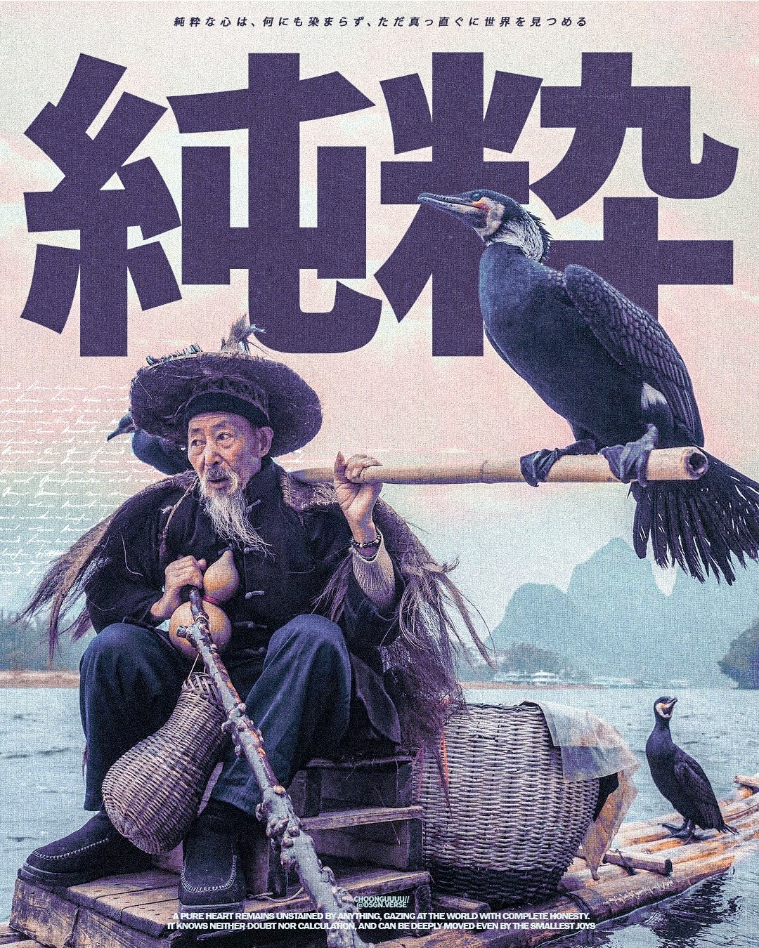
'Pure', 2026
There is a particular discipline in knowing the difference between a design that arrived and one that was forced out. DSGN VERSE has made that distinction the backbone of how he works, and the evidence is on his feed if you know what you're looking at. The failed pieces are still there. He left them there on purpose. What surrounds them is Photoshop pushed somewhere it wasn't necessarily meant to go, smoke built into letterforms, grain laid over color until it breathes, two references that had no business being in the same file until they were. He is self-taught, working without a brief, answering to nothing but whether something clicked. The goal he keeps coming back to is a strange one for someone still building: to be forgotten, to make work so embedded in how designers think that the source stops mattering. He's not there yet, but the signature is already recognizable. Follow his work on Instagram at @dsgn.verse.