

Digital
Digital Painting

Isabel Lauren Loewe

'Untitled', 2026
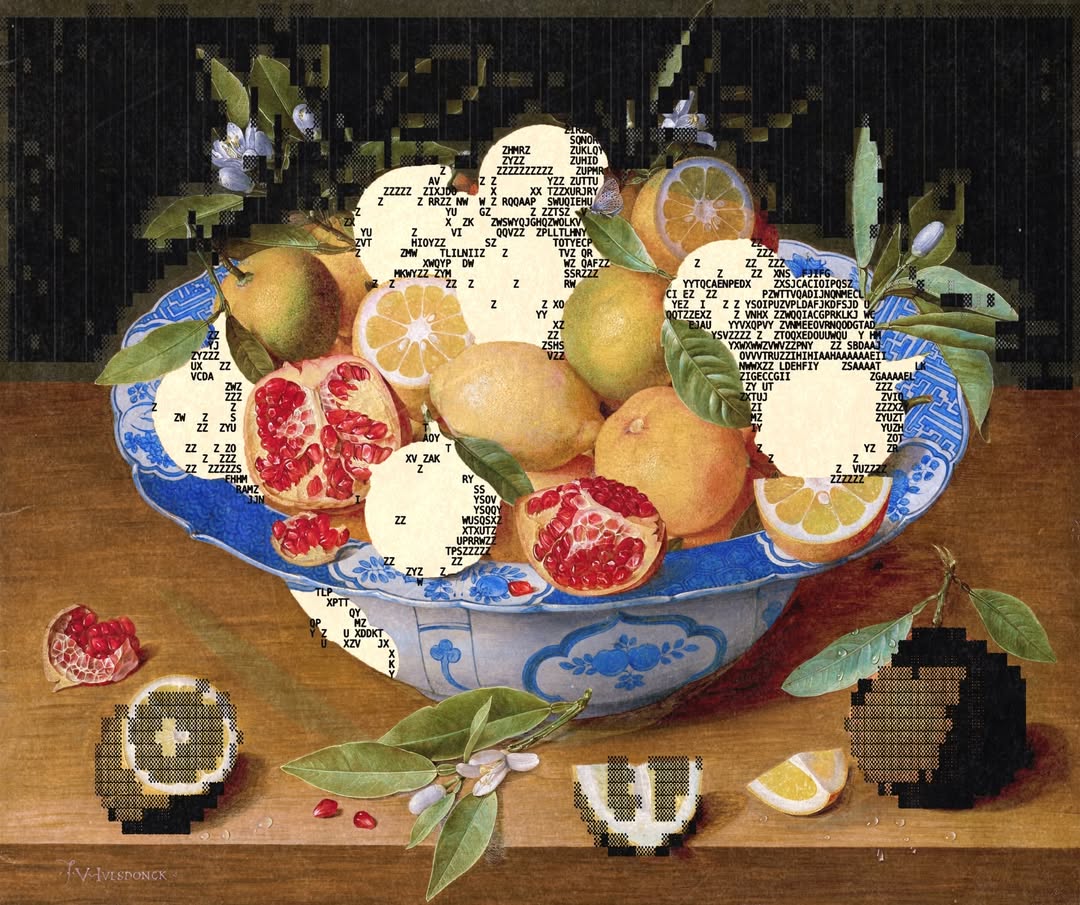
Enigmatriz builds images out of a strange collision between old paintings and digital code. A horse from a historical canvas, a figure from a public domain archive, a still life pulled from another century, all interrupted by characters, symbols, and cream-white texture. The work feels both antique and technological, as if the past has been run through a machine and returned with a new surface.
His style began as an experiment in texture. At first, ASCII was only a secondary element, a way to add grain and disruption to the work he was already making. After a few pieces, he realized the tool could become the main visual language. Now the characters can act like shadow, distortion, movement, decoration, or structure, depending on what the original image asks for. The balance matters. The source still has to be recognizable, but the intervention has to change how it is seen.
That balance comes from his background in graphic design. Enigmatriz thinks in terms of constants and variables, keeping certain textures and colors consistent so the work belongs to the same world while letting each piece shift inside it. The result is a style that feels controlled even when it is experimental. Classical imagery gives the work its body, and ASCII gives it a new kind of skin.

'Untitled', 2026
How did you first get into art and design, and do you have a background in design school?
Since I was very young, I always liked doing anything involving creativity. Later, toward my teenage years, I started having a passion for traveling, and I knew I wanted to live my life that way. So it was a matter of pursuing a career that would let me live that lifestyle, and that was graphic design.
While studying, I started discovering many artists doing art digitally that really inspired me to begin doing things on my own, and that’s how I began experimenting with art. I believe both things complemented each other very well at that time. I realized I was doing much better in college, and college was teaching me many things that were really helpful in art, like composition, use of colors, etc.
I graduated from graphic design in 2024.
When did you find this style?
This particular art style, a style which I call “ASCII art,” was found while trying to add texture to my works, kind of like a secondary element in the style I was doing at the time. I began using an image-to-ASCII tool, and after doing it for a couple of artworks, I saw how broad the possibilities of experimentation were, and I decided to turn that into the primary element of my artworks.
How has your work changed since you first started posting, and is there a piece you consider a turning point?
A lot. It’s been four years, and it took me a while to find a style I could work with for a long time.
Yes, “last Friday night” is one piece of mine where it suddenly clicked that instead of doing textures with ASCII, I could make it a whole visual language on its own. Also, when I did the still life modified with ASCII elements, which went super viral, at the time I didn’t really think much of the artwork. It wasn’t one of my favorites, but it was sort of the beginning of this ASCII subgenre where I modify traditional paintings with ASCII.
For readers who may not know, what is ASCII art, and how do you think about it as a medium?
I’d say ASCII art is basically utilizing ASCII and its diverse set of characters to play a visual role in artworks. At some point in the past, you would only see figures shaped with these characters in black-and-white format. I believe that nowadays it has evolved into something much more interesting, where ASCII is blending with many forms of art such as photography, traditional art, animations, etc.
How does your work start, and what does the process look like?
It always starts by browsing images in the public domain, and when I eventually stumble upon something I think can be cool to work with, I download the image and then start extracting certain elements from the piece that will later be turned into ASCII.
It’s pretty straightforward, mainly taking figures or parts of an artwork and turning them into code, glyphs, and symbols with ASCII. Sometimes I’m minimalistic about it, and sometimes I add as many of these elements on top of each other as possible. This I call “ASCII maximalism,” and I’ve done a series about it.

'rabbit meetup', 2026
What software or tools are central to your process?
Photoshop and image-to-ASCII tools.
Your sketchbook posts show what looks like physical, hand-drawn pages mixed with ASCII elements. Can you walk us through what is actually happening there? How much of your process is physical versus digital?
For now, all my process is digital. I figured it would be fun to mix something so technological with such a material thing like a sketchbook, and a contrast like this is usually present throughout all my ASCII works. I am always bringing physical artworks to my practice, and in a collage style, I add something which is recent, modern, and that creates, in my opinion, a striking contrast.
You have catalogued at least 11 distinct ways you use ASCII in your work, from interventions into old paintings to textural distortion to frame-by-frame animation. Do you move fluidly between these modes, or does a given idea dictate the approach?
These were catalogued after viewing that; depending on the artwork I chose to work with, I typically knew which treatment it would get. So far, it’s around 11 different ways, but with constant experimentation, you are bound to stumble upon new ways of expanding visually into new terrains. That has been my goal since I started doing art with ASCII: to expand and see how far we can push this tool in the form of visual art.
What made you settle on the elements you currently use? They work so well together and create such a unique emotion. It really feels like anything more would be too much.
I always try to keep certain elements constant throughout my works, so they all feel like a group, like a style with its own rules. For example, the texture on top of all my ASCII works has never changed. It’s always the same one, and it unifies all my works.
Before doing ASCII art, I would try to go for a different texture for each artwork I created, and although experimenting with it is also a great exercise, I found that certain elements are nice to keep if they work well. Same with that cream white, which is present in almost all of my works. These are things that unify a visual language, constants, and it is also really important to have variables as well, so that each artwork can be differentiated from the other, although they come from the same visual language.
Are you more of a designer or an artist?
I’d say I’m more of an artist, but with heavy graphic design influences. What I was saying previously about unifying a visual language with certain constants and variables is something that any graphic designer understands. It’s something I was taught. I’d say art gives me the ability to experiment freely, while graphic design gives me the ability to plan, to think logically and strategically about what I’m doing. It’s a balance between both.
Do you spend a long time on each piece, or do they come to you in your head instantly?
Not much. With ASCII, it’s more about playing around and presenting ideas rather than doing super detailed and thought-out works.
When is a piece finished?
When I feel that the balance is right.
You return to classical and historical paintings repeatedly as source material. What draws you to that specific visual archive?
Since most of my work is collage and relies on previously existing artworks, I had to find works that were in the public domain so I could be able to work with them. An artwork is in the public domain typically 80 years after the artist has passed away, so all works are generally classical and historical paintings. It was not planned, but it did kind of accidentally bring me to the dialogue between past and present or future that many of my works have.
Animals, particularly horses and rabbits, show up constantly in your work. Is that intentional or something you noticed after the fact?
I love working with horses, and for some reason they seemed to have felt the same a couple hundred years ago, since many public domain artworks contain horses. It’s such a distinct and recognizable shape that it’s always fun to work with. Animals in general are nice to work with because of their shapes and our familiarity with them. I can abstract them as much as I want with ASCII and the figure will still be recognizable.
Your titles and captions are often very spare, usually just a word or two. How do you think about titling?
Some are very literal; the majority describe what we see in the artwork. Others are a bit more toward the feeling the piece evokes for me, like, for example, “hope.”
I don’t go too crazy with titles because all of my works are a product of experimenting and pushing boundaries visually. There’s not a symbolic depth to what I do on each separate piece, but rather a need to use this tool to visually create new things and push it further. So for the moment, I’m focused on that.

'Fruits', 2026
The text and characters in your work are sometimes legible, sometimes purely textural. Do you control what the ASCII actually says, or is the visual effect the only thing that matters?
I am generally mostly focused on the visual effect, so the characters are random. I do choose what type of characters, though: letters, numbers, etc. However, I do sometimes choose to edit the characters to say something specifically. It’s also really fun, but I do it only if it feels necessary.
When you are intervening in an existing painting, how do you choose which elements get the ASCII treatment and which stay untouched?
Since we are talking about abstracting areas or elements from a specific artwork, these abstracted elements should be recognizable in some way. That’s when the piece becomes more powerful, because it’s a blend, a balance between realism and abstraction that has to be right in order to work. I mostly abstract figures or shapes, things you can still understand abstracted with the ASCII treatment.
You did the cover and opener for Bloomberg Businessweek. How did that commission come about, and what was it like translating your personal work into an editorial context?
I worked for Bloomberg last year, so we had already worked together previously. My work has a very resonant feeling with how the world is right now because with new technologies like AI, we are constantly comparing what the new world is about to bring versus how it previously was. Therefore, most of my commissions nowadays are related to AI.
How do you approach a commission versus a personal piece?
Same way. I’m just following a specific direction for a commission, whereas on a personal piece I follow my own direction.
What secrets of the trade would you give a younger designer aspiring to your level?
Consistency and patience. With that combination, you can reach whatever you want. I believe this can be applied to anything, not just art.
Is there a piece that surprised you with how it resonated, and one that you expected more from?
Yes, “still life, modified with ascii elements.” is one I got very surprised by the reception. Sometimes it happens that I love a piece and it receives little attention, but I don’t think much about it. I just keep going.
People in your comments frequently ask if you sell prints. What is your relationship to the commercial side of your work?
I believe artists should always pay attention to the commercial side if they want to make a living out of it. There’s time for experimentation and art, but there also has to be time for the marketing and selling aspect. There needs to be a balance between these things.
Do you ever want to make physical pieces, and if you were to move into physical work, what form do you imagine it taking?
Maybe. I am always open to expressing myself creatively in different mediums. This year, I’ve done an ASCII playing cards deck, which I’m selling right now. I also want to make clothing and other stuff eventually.
If I were to move into physical work, I imagine it taking the form of clothing.
You have worked across personal projects, editorial commissions, and what looks like ongoing visual research. How do you hold all of that together as a single practice?
Just doing stuff every day, being consistent and changing focus to different areas when I need to.
What are you most interested in exploring next?
Long-term projects, something that will take me a while to create. I’ve been working on one since October of last year, and it’s pretty much done. At some point, I’d like to return to a similar practice, but for now I’m back to experimenting.




Articles
Magazine
Submissions